
Sunday, November 25, 2012
Digital Painting Considerations
Bringing concept art into the digital medium brings about a whole range of variables and considerations with how to produce and present the art. The key word here is 'choice'. Painting digitally gives you tremendous amounts of choice, while reducing time, effort and mess that might normally have to be endured with traditional mediums.
One of the more obvious differences between traditional painting and digital painting is the lack of actual paint.
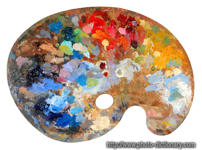
 Digital painting provides palettes and swatches without having to mix paints. It allows for precision colour selection in seconds. Many digital painting programs also include a colour mixer where you can digitally simulate traditional mixing of paints for those who are more comfortable with traditional mediums.
Another benefit is canvas size. In painting software, you can have massive canvases for printing at any size. The maximum size of your canvas is usually constrained to the processing power of your computer.
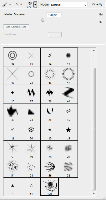
However, one of the biggest considerations with moving to digital painting is the brushes you use. They are important not because the right brush is essential to a good painting, but because it's something many digital artists obsess over. There are some brushes that have benefits for traditional painters. For example, you can simulate the tilt of a traditional paintbrush, which alters the appearance of the brush stroke. But the biggest danger when learning to paint digitally is to get too focused on custom brush shapes.
 These shapes are often designed to make the painting process quicker and easier, and gives you texture without spending more time layering paint strokes to do the same thing. While this is useful to the seasoned artist, a beginner may start to rely on custom brushes to produce the effect they want. This may hinder overall development as an artist. Many professionals recommend using either one brush of any shape and just sticking to that one, or just using the basic round brush which comes with programs like photoshop.
This all doesn't mean that digital art makes traditional art redundant, or unimportant. But digital art is nearly essential with its time-saving properties, which the games and film industries rely upon.
One of the more obvious differences between traditional painting and digital painting is the lack of actual paint.
Another benefit is canvas size. In painting software, you can have massive canvases for printing at any size. The maximum size of your canvas is usually constrained to the processing power of your computer.
However, one of the biggest considerations with moving to digital painting is the brushes you use. They are important not because the right brush is essential to a good painting, but because it's something many digital artists obsess over. There are some brushes that have benefits for traditional painters. For example, you can simulate the tilt of a traditional paintbrush, which alters the appearance of the brush stroke. But the biggest danger when learning to paint digitally is to get too focused on custom brush shapes.
This all doesn't mean that digital art makes traditional art redundant, or unimportant. But digital art is nearly essential with its time-saving properties, which the games and film industries rely upon.
Perspective
Whether you are concepting a figure, object or an environment, perspective is essential to realism. It is the consideration of distance and scale between relative objects and forms, and when it is ignore, it completely destroys an art piece. Following perspective is to study the laws of how we perceive depth in environments. And while some believe that perspective lines and guides is the realm of the architect or designer, artists must also obey these laws if they wish to create believable subjects.


There are 3 main versions of perspective in artwork, and while all are useful in certain circumstances, they represent an increase in complexity. The first, is one-point perspective.
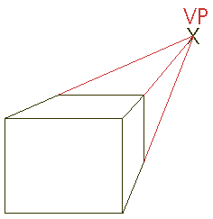
This involves drawing all objects in relation to one dimension of depth. There is a 'vanishing point', which is a point on a horizon where all depth lines would eventually converge. This method of perspective is very simple, and is usually the first to be taught to art students. It is usually ideal for depicting environments containing relatively simple objects.
The second type of perspective is two-point perspective.

It adds considerably more complexity to environments depicted this way, but they also appear more believable. There are more faces that are scaled according to depth, and depending on the position of the faces, the lines point towards one of two vanishing points.
The third type is three-point perspective.

Three point perspective adds depth to all three geometric dimensions. The third vanishing point is usually towards the top or bottom of the environment, and most vertical lines converge there. While this is the most complex perspective method to plot, it is great for depicting dramatic scenes that greatly emphasise sheer scale and depth.
Light
In all digital painting and concepting, light is one of the most, if not, the most important factor in a readable and attractive art piece, as it's the way we perceive all objects. Painting light can also be a very difficult simply because light is something that everyone recognises quickly, and while not everybody understands the laws of depicting light artistically, it's very obvious when light appears wrong. Let me describe the basics of light behaviour.
 As you can see from the diagram, there are various components in shading an object, and there is often more than one light source. Lights are rarely perfect white lights, and shadows are rarely totally black. This is how an object usually appears outdoors on a normal, sunny day. There is one main, small and bright light source, which is the sun. Naturally, this casts shadows in the same direction that the light is shining. But one thing that often is ignored is that there is a massive secondary light source outdoors, which is the sky. In this example, the earth's atmosphere has been hit by sunlight, and the nitrogen/oxygen atmosphere has scattered photons at the blue end of the light spectrum. This gives a soft and bluish secondary light source. The cast shadow of the object is frequently coloured by the light of this secondary light source, combines with reflecting light from the primary light source. This bounced light will also often illuminate the side of the object closest to the cast shadow. In this example, the terminator is the shadow of the object least illuminated by any light source, which still often is coloured by some bounced light. Hence, to depict realistic looking objects in your concept art, you must seriously consider the direction the light is shining from, and also the colour of your lights and shadows. This will greatly enhance realism and believability.

Tuesday, September 18, 2012
Colour Theory
Just like composition, colour within a concept image is extremely important when it comes to forms and objects reading well. As my 2 dimensional art pursuit had started (and indeed remained for many years) in black and white graphite drawings, I essentially had to learn colour theory and the magnitude of its importance from the ground up. What follows is just some of what I have learned about implimentation of colour in 2D art.
 Many of us were told in primary school of the basics of colour theory. In artistic terms, there are 3 Primary or First-Order colours; Red, Yellow and Blue. From these, there's an additional 3 Secondary colours (Orange, Green and Purple) created by combining 2 Primary colours. There is also a range of Tertiary colours created by combining a Primary and Secondary colour in varying amounts.
What is less often taught is how different colours work better together than others, and how effective colours are in setting mood and atmosphere.
There are several ways of combining colours to appear aethetically pleasing. One of these is using complementary colours. These are 2 colours that are opposite one another on the colour wheel. A general rule of thumb is that placing a complementary colour within its matching colour will make a focal point, as it's the highest point of contrast. Complementary colours often have different intensities, which means that to balance one intense colour, you would need to use more of its less intense match within the image to create pleasing balance.
Analogous colour schemes are another style of colour composition in art. This is a far less intense and high-contrast method than straight complementary colours. It involves choosing 1 colour and 2 others which are on either side of it on the colour wheel. The more relaxed nature of the colours often allow for more viewer immersion withing the image, as it's less harsh on the eyes, and hence more pleasing to look at.
Analogous colours can be seen in this painting that I created for our game project.

As you can see, almost all the colours within the image's atmosphere are around red, purple and dark orange. The only exception is the high-contrast (almost complementary) blue on the protagonist. This is to draw attention to her. High contrasting colours can be jarring to look at, but can also be very useful for drawing attention to points withing an image if used sparingly.
There are other colour mixing methods (split-complementary, triadic, etc.) and many more colour management styles that I haven't mentioned. Altering levels of saturation with colours can create even more complex colour schemes.
Monday, August 27, 2012
Composition
I discovered a free online tutorial written by Phil Straub describing the fundamental rules of composition within paintings and concepts (http://www.cgsociety.org/index.php/CGSFeatures/CGSFeatureSpecial/phil_straub_composition_tutorial). I've learned how the rules and guidelines behind effective composition are used to arrange elements within a painting (frequently an environment) to make it as visually pleasing and engaging as possible. In my current sci-fi game project, to flesh out and plan the atmosphere within the game, environment concepts were highly necessary. I went about using the rule of thirds to help compose this piece.
 The rule of thirds works by splitting the canvas, digital or otherwise, into 9 separate squares with implied lines, and placing focal points at one of the 4 intersections of these hypothetical lines.
 In the above concept of a starship coolant room, the continuing hallway is the main focal point, placed in the bottom left intersection. The coolant towers work to draw the eye into the focal point, and to discourage the viewer looking away from the image.
Once I've fully grasped the basics of composition, I'll move into more complicated implied forms within my paintings.


Once I've fully grasped the basics of composition, I'll move into more complicated implied forms within my paintings.
Intro
My name's Jeremy, and this blog is dedicated to the documentation of my research in the Game Design Industry. Specifically, I'll be investigating various techniques and tricks for producing 2 dimensional concept art for game projects.
Subscribe to:
Posts (Atom)